Shiseido
Every Idea Starts With a Spark
Awakening cultural heritage to new beginnings
In our eternal search for synergies between the Japanese and Scandinavian design cultures, we have collaborated with Shiseido and developed a visual identity and signage system for their new Global Innovation Center in Yokohama.


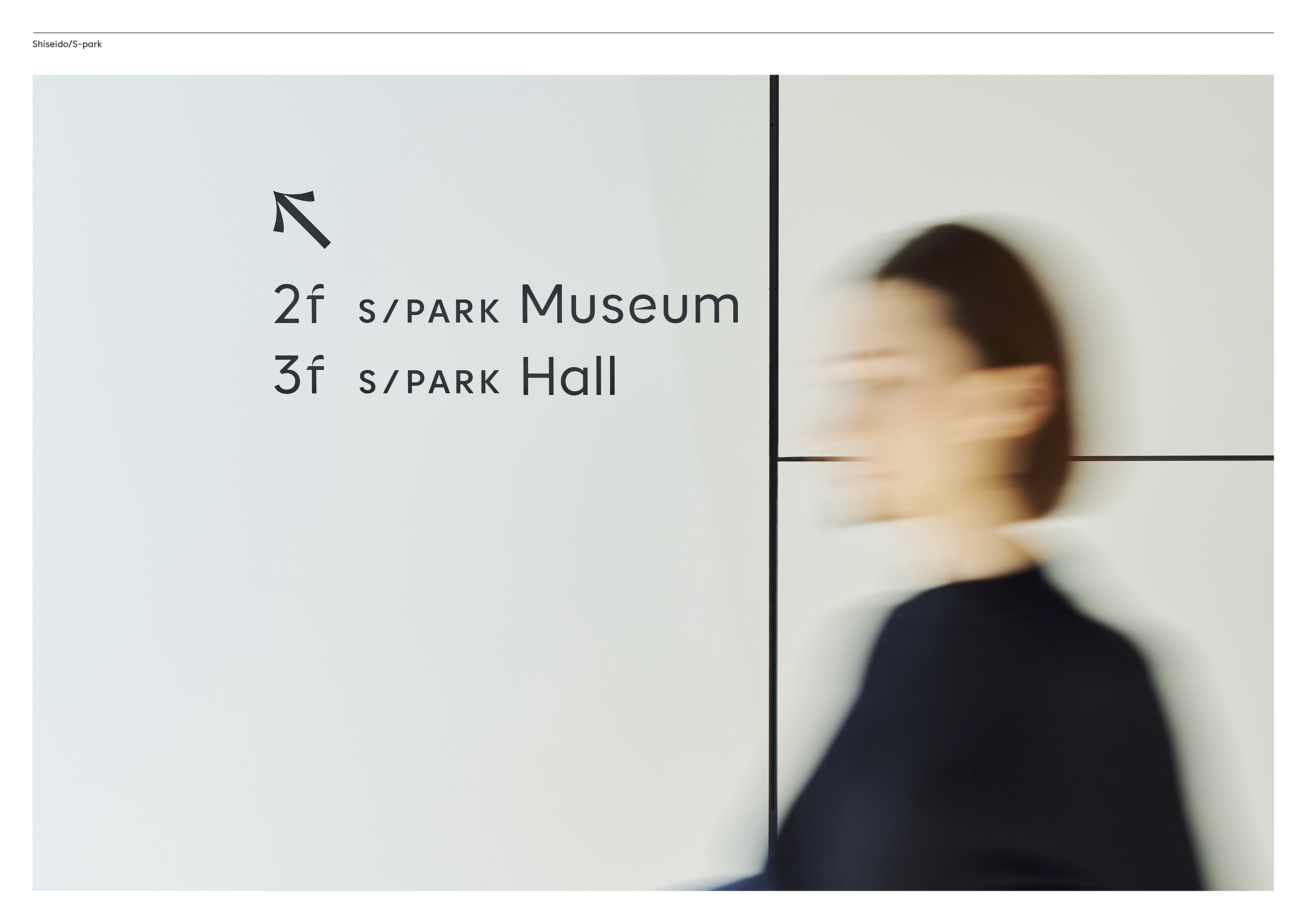
Reflecting on signage
The curved and bent signs harmonise with similar shapes in logo, typeface, and pictograms. The curves reflect light in different ways, giving the signs a variety of nuances as you shift direction or interact with them. They stand and hang freely as single sheets of paper, which through their transience imbue both intellectual and aesthetic quality. The signs are built on the historic Japanese philosophy of simplicity in emptiness - breeding spirituality and rich imagination. Seen from above, the larger signs curve like the top of a stretched out' S' - a smooth and subtle ode to Shiseido.


Sparks in typeface
The visual language salutes the unique Japanese typeface of Shiseido, which stems from the Taisho-era (1912-1926) and is characterised by its inspiration from Latin blackletter design. The custom typeface is built with a range of alternate characters which can carefully, but seemingly random, be used to provoke sparks in writing. The concept finds its roots in core elements of Shiseido's rich cultural heritage fired with a layer of experimentation and unconventional typographic treatments to create an identity that builds on the past and looks to the future.

Regular

Alternates

Spark typeface
Every idea starts with a spark. A spark of insight. A spark of excitement.


A holistic collaboration
Guided by Shiseido's high ambitions, the Innovation Center includes work by world-renowned designers and architects such as Gensler, Kajima and Nendo. S/PARK encompasses two meanings: ‘Shiseido Park' — a place where people come together; and 'Spark' as in the spark which drives creativity and new ideas. It was our goal to create solutions which are individually unique, yet work as mediators for the other designers and architects throughout the entire innovation centre, inside and out.


Tomoe Hamaguchiya
Japan Representative Director
Reach out to Tomoe to learn more about this project or how we can help you.
